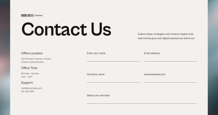
📝🚫 The Real Reason Visitors Don’t Fill Out Contact Forms
You’ve done everything “right.” The form is short. The button says “Get in Touch.” It’s placed above the fold, in a contrasting color, with a friendly headline right above it. And yet, visitors land on the page, scroll past it, and leave without typing a single letter. 🙈
It’s tempting to blame the form itself — maybe it needs fewer fields, a bolder button, better copy. Sometimes that’s true. But more often, the form isn’t the problem at all. It’s the messenger being blamed for a decision that was already made before the visitor ever got there.
The Form Isn’t Being Rejected — The Commitment Is
A contact form asks for something bigger than it looks like it’s asking for. On the surface, it wants a name, an email, maybe a phone number. Underneath, it’s really asking: “Are you ready to start a relationship with this business?“
That’s a much heavier question than it appears, and most visitors quietly answer it before they even notice the form exists. If they haven’t yet decided you’re worth that step, no amount of form-shortening will change their mind — because the hesitation was never about the form fields. It was about whether they trust you enough to hand over their contact information at all. 🔒
What’s Actually Happening in a Visitor’s Head
1. “I’m Not Sure What Happens After I Submit This” 🤷
Uncertainty about the next step is one of the most common — and most overlooked — reasons people abandon a form. Will someone call immediately? Will they get bombarded with emails? Is this a soft inquiry or a binding commitment? When the outcome feels unpredictable, hesitation is the safer default.
2. “This Feels Like the Point of No Return” 🚪
Many visitors treat a contact form as the final step before being “in the funnel” — fielding sales calls, follow-up emails, retargeting ads. Even genuinely interested people sometimes aren’t ready for that level of commitment yet; they just wanted more information, not a relationship.
3. “I Don’t Fully Trust This Site Yet” 🛡️
If trust signals — reviews, real photos, clear company details, a privacy policy — are thin or missing, handing over contact information can feel riskier than the form’s short length suggests. People are protective of their inbox and phone number, often more than they’re protective of their wallet.
4. “I Still Have Unanswered Questions” ❓
A visitor with lingering doubts about pricing, process, or fit is unlikely to commit to a form, because filling it out doesn’t resolve those doubts — it just moves them further into a process they’re still unsure about.
5. “This Feels Like Effort for an Uncertain Payoff” ⚖️
Even a three-field form requires a small amount of mental effort and vulnerability. If the expected reward — a reply, a quote, a solution — feels vague or delayed, that tiny bit of effort can outweigh the perceived benefit.
Why Shortening the Form Alone Often Doesn’t Help
Reducing a form seven fields to three sometimes moves the needle, but businesses are frequently surprised when conversion barely budges. That’s because form length was rarely the core issue — it was a symptom sitting on top of a trust or clarity problem. Removing two fields doesn’t answer “what happens after I submit this,” and it doesn’t build the confidence a hesitant visitor was missing. ✂️
Real improvement usually comes from addressing the psychological weight behind the form, not just its physical size.
What Actually Increases Form Completions
1. Set Clear Expectations Right Next to the Form 📋
Tell visitors exactly what happens next: “We’ll reply within one business day with a free quote — no obligation.” Removing uncertainty about the outcome removes a major source of hesitation.
2. Lower the Perceived Commitment 🪶
Language matters more than people expect. “Get a Free Quote“ feels lighter than “Contact Sales.” “Ask a Question” feels lighter than “Submit Inquiry.” Small wording shifts change how big the step feels.
3. Add Trust Signals Nearby, Not Just Elsewhere on the Site 🛡️
A short testimonial, a real team photo, or a simple privacy reassurance (“We’ll never share your information”) placed directly beside the form does more than the same trust signals buried in a footer.
4. Offer a Lower-Commitment Alternative ⬇️
Not everyone is ready for direct contact. A live chat option, a downloadable guide, or a simple FAQ link nearby can capture interest from visitors who aren’t ready for a form yet — without losing them entirely.
5. Address the Obvious Objection Right There 💬
If pricing or process is the most common hesitation, don’t make people fill out a form just to find out. A short line answering the biggest objection near the form can resolve doubt before it turns into abandonment.
6. Make the First Ask Small 🔑
Sometimes splitting a longer form into a tiny first step (“Just enter your email to get started“) followed by additional details afterward performs better than asking for everything up front — because the first commitment feels almost effortless.
The Bigger Lesson
A contact form is rarely ignored because visitors are lazy or the fields are too numerous. It’s ignored because it represents a decision the visitor hasn’t emotionally made yet — and no amount of interface polish can substitute for the trust, clarity, and confidence that decision actually requires. 🌟
Fixing form conversion isn’t really a design problem. It’s a psychology problem wearing a design costume. Address the real hesitation, and the form that’s been sitting empty for months can suddenly start filling up — without changing a single field. ✨
❓ Frequently Asked Questions
Q1: If shortening my form doesn’t help much, should I make it longer instead?
Not necessarily. Length isn’t the core issue in either direction — clarity and trust are. Focus on what’s causing hesitation before adjusting field count in either direction.
Q2: How do I figure out what’s actually causing my form abandonment?
Look at behavior data (where people stop, how long they hover before leaving) and, if possible, ask a few real visitors directly. Session recordings and simple exit surveys often reveal hesitation points that aren’t obvious from analytics alone.
Q3: Does adding a phone number field always hurt conversions?
It depends on context. A phone number can feel like a bigger ask in casual browsing scenarios, but in high-intent situations (like requesting an urgent quote), it can actually feel appropriate and expected. Match the field to the visitor’s mindset.
Q4: Is live chat a good replacement for contact forms?
It’s a good complement, not necessarily a replacement. Live chat captures visitors who want quick answers without commitment, while a form still works for people who prefer to explain their needs in detail or contact you outside business hours.
Q5: Will adding urgency, like “limited spots this month,” help form completions?
It can help, but only if it’s genuine. Fabricated urgency around something as personal as contact information tends to feel manipulative and can damage trust rather than build it.