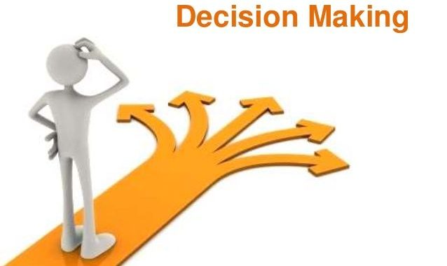
🧠 The Psychology of Online Decision-Making
Every time someone scrolls a product page, hesitates over “Buy Now” 🛒, or ditches a cart at the last second, an entire hidden machinery of the mind is quietly running the show. Online choices feel instant ⚡, but underneath that speed sits a mix of mental shortcuts, emotional pulls, and social signals that quietly steer what we click, buy, and believe.
This isn’t just useful knowledge for marketers 📈 — it explains why we behave so differently behind a screen than we would in a real store, and why some websites feel effortless while others quietly push us away. 🚪
🖥️ Why Online Decisions Play by Different Rules
In a physical shop, a salesperson can read your body language, answer questions on the spot, and earn trust through simple conversation. Online, none of that happens naturally — trust has to be engineered into the experience itself. 🏗️ That missing human presence changes how people weigh their options, and it opens the door to both thoughtful design and outright manipulation.
Three things make digital decision-making its own beast:
- ⚡ Low friction – A purchase is often just a couple of taps away, which speeds up impulsive choices.
- 🌊 Information overload – Endless reviews, filters, and comparisons can drown a decision instead of clarifying it.
- 👤 Anonymity and distance – With no human on the other side, trust has to come from design, reviews, and reputation instead of a handshake.
⚖️ The Two Minds Behind Every Click
Psychologists often split decision-making into two mental “systems” working side by side:
- 🐇 System 1 (fast & intuitive) – Snap judgments driven by gut feeling. Most casual browsing runs on this track — a photo, a headline, or a price tag gets judged in a blink.
- 🐢 System 2 (slow & deliberate) – Careful, logical weighing. This switches on when a decision feels risky or expensive — think signing a year-long contract or buying something pricey.
Smart websites design around both: low-stakes actions (saving something to a wishlist 💾) stay effortless for the fast brain, while big decisions (checkout, subscriptions) offer just enough detail to satisfy the slow, careful brain — without piling on needless friction.
🎭 Cognitive Biases Quietly Steering Online Behavior
👥 Social Proof
People look to the crowd to decide what’s safe or worth it. Star ratings ⭐, review counts, and “500 people bought this today” nudges reduce uncertainty by implying others already did the vetting for you.
⏳ Scarcity and Urgency
“Only 3 left!” 🔥 or a ticking countdown timer ⏱️ taps directly into loss aversion — our surprisingly strong tendency to fear missing out more than we enjoy gaining something. That’s why limited-time deals convert better than open-ended ones, even when the offer underneath is exactly the same.
⚓ Anchoring
The very first number someone sees colors how they judge everything after it. A slashed-out “original price” next to a discount makes the new number feel like a steal 💸 — even when that original price was set artificially high to begin with.
🌀 Choice Overload
More options don’t automatically mean better decisions — often it’s the reverse. Facing too many near-identical choices, people freeze, stall, or bail entirely. That’s why trimmed-down menus and “recommended for you” sections 🎯 often beat showing absolutely everything.
🎯 The Decoy Effect
Slipping in a third, deliberately less appealing option can quietly push people toward the choice a business actually wants. Classic example: small coffee $3 ☕, large $7, medium $6.50 — the medium mostly exists to make the large look like the obvious win.
🔗 Commitment and Consistency
Once someone takes a tiny step — making an account, dropping an item in the cart 🛍️ — they become far more likely to follow through on something bigger, since backing out would feel inconsistent with the step they already took.
💓 Emotional Triggers in Digital Spaces
Buying decisions are rarely pure logic. Emotion plays a starring role — especially online, where the entire environment can be shaped on purpose:
- 🛡️ Trust and safety cues – Security badges, clear return policies, and upfront pricing calm the nerves around an unfamiliar purchase.
- ✨ Aspiration and identity – Products framed around a lifestyle (“for people who care about sustainability” 🌱) tap into how people want to see themselves.
- ⚡ Instant gratification – One-click checkout and same-day delivery satisfy the brain’s hunger for a reward now rather than later.
- 😌 Regret avoidance – Free trials, money-back guarantees, and painless returns lower the emotional risk of a “wrong” choice, making people far more willing to commit.
🎨 How Design Quietly Guides Every Decision
No interface is neutral — every layout choice nudges behavior somewhere, whether it’s intentional or not.
- 👀 Visual hierarchy – Bigger, brighter, or more central elements get noticed first and are judged as more important.
- ✅ Default options – People tend to stick with whatever’s pre-selected (like a pre-checked “yearly billing” box 📅) rather than actively opting out — this is default bias in action.
- 🐌 Friction as a tool – Sometimes extra steps are added on purpose, like a confirmation screen before canceling a subscription, to slow down a decision a business would rather you skip.
- ✏️ Micro-copy – The exact words on a button (“Start My Free Trial 🎁” vs. plain “Submit”) can shift completion rates just by changing how safe or rewarding the click feels.
🛒 Why People Abandon Decisions Mid-Way
Cart abandonment and checkout drop-off 📉 aren’t random — they almost always trace back to one of a handful of psychological friction points:
- 💰 Surprise costs showing up late in the process, breaking the trust built earlier.
- 📝 Too many form fields, which makes the effort feel bigger than the reward.
- 🔒 Uncertainty over returns or data privacy, which reactivates natural risk-aversion.
- 🐢 A lack of urgency, letting good old procrastination take the wheel.
Fixing this drop-off usually isn’t about pushing harder — it’s about spotting and removing the exact psychological snag causing the hesitation. 🔧
🧭 Using This Psychology Responsibly
There’s a real line between designing for clarity and designing to manipulate. Tricks like fake countdown timers ⏰, hidden fees that appear only at the final step, or deliberately confusing cancellation flows exploit these same principles — often labeled “dark patterns” 🕳️. They might juice short-term conversions, but they tend to quietly erode trust and damage relationships the moment people catch on.
The far more sustainable path is using this same psychological insight to reduce genuine friction and doubt — honest pricing, real urgency, simpler choices, and design that respects a person’s time and intelligence. 🤝 That’s what actually builds decisions people don’t regret — and regret-free decisions are what drive repeat business and referrals over time.
🌟 Final Thoughts
Every click online is a tiny psychological event shaped by trust, emotion, mental shortcuts, and design choices — most of it happening well below conscious awareness. 🧠✨ Understanding these mechanisms doesn’t just help businesses build better experiences; it helps all of us become sharper, more intentional decision-makers in a digital world engineered to move fast.
The businesses that win in the long run 🏆 aren’t the ones manipulating hardest — they’re the ones who understand this psychology deeply enough to make the good decision feel like the easy one.